
Comic Sans shunned
How the notorious font became arguably the most hated font of all time
Comic Sans has caused many controversies over the internet about where and when it’s okay to use it.
This mediocre font was originally created for use in a program called Microsoft Bob. Within this program were “help” bubbles in which a small dog helped with whatever your issue was. The bubbles were meant to be written in Comic Sans, but the font was not made soon enough to be inserted into the program.
Instead, the font began being used in comic books and other places where speech bubbles were located.
However, the font became popular quickly in uses with young children, primary schools and other childcare organizations for its fun, child-like appearance.
The font eventually made its way into the wrong hands when hospitals, restaurants, newspapers and supermarkets began to use the font to portray serious information. In these public places, signs and newsletters were using this comical font in the wrong way.
From this point in the font’s journey, Comic San’s popularity took a snowball effect in a very negative way.
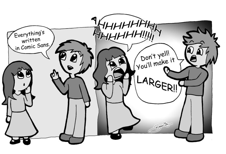
Many designers would know that each font has the ability to depict a personality to the writing that words cannot. Typography is a form of art. If a drawing of a skull cannot portray life, then Comic Sans cannot portray a serious message.
So what makes Comic Sans such a bad choice? Short answer: its popularity. Many know the horrors of Comic Sans and a reader may focus more on the use of font than the word choice.
Popularity aside, the font brings out a naive, juvenile and immature feeling along with the writing that another font, such as Arial or Times New Roman, would not. Any formality of the writing has gone because all fonts have different moods.
On a different level, Comic Sans can cause a financial disadvantage over other fonts. For example, each letter is spaced out from each other more than many other fonts. Not only are they spaced apart, but the letters are also spaced unevenly. These two issues can cause much more paper to be used when dedicated to Comic Sans and in Freedom High School, we must conserve all the paper we can.
An even more common issue, the expense of printer ink, is another problem with the childish font. The letters, being thicker than more commonly found fonts, take up much more ink per letter.
Knowing when to use Comic Sans can definitely help when trying to get a certain mood across to an audience.
Even though there are many other font options that can portray the same mood, it may be okay to use this particular font when addressing a young audience, writing a comical note to a friend or family member or for use in a speech bubble.
Writing and designing are forms of art and choosing a good font can help tremendously in how a reader will feel about it. Fonts have personality and we have the power to choose that for our writing.